Google Sheets is a powerful tool that allows users to analyze and visualize data in a user-friendly interface. Whether you are a beginner or an advanced user, Google Sheets provides a wide range of functions and features that can help you make sense of your data. In this article, we will explore how to use Google Sheets for data analysis and visualization.
To start using Google Sheets for data analysis, you first need to import your data into a new sheet. You can do this by either copying and pasting your data or by importing a file from your computer. Once your data is in Google Sheets, you can use functions like SUM, AVERAGE, and COUNT to perform basic calculations on your data.
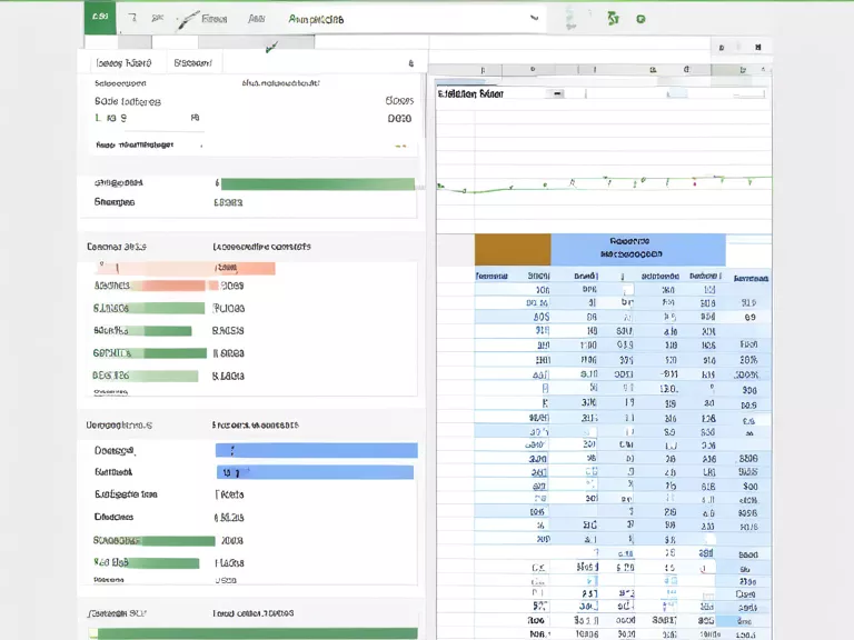
If you want to visualize your data, Google Sheets provides a variety of charts and graphs that you can use. To create a chart, simply select the data you want to visualize and click on the "Insert" menu at the top of the screen. From there, you can choose from a variety of chart types, including bar charts, line charts, and pie charts.
In addition to basic functions and charts, Google Sheets also supports more advanced data analysis features, such as pivot tables and conditional formatting. Pivot tables allow you to summarize and analyze large datasets, while conditional formatting allows you to highlight important data points based on certain criteria.
Overall, Google Sheets is a versatile tool that can help you analyze and visualize data in a simple and intuitive way. By following the tips outlined in this article, you can make the most of Google Sheets for your data analysis needs.